A new brand for the YBA!
At The Yorkshire Baptist Association we have a clear vision to grow disciples by multiplying healthy churches across Yorkshire through planting, revitalising and reimagining. We also have five additional priorities that underpin this.
One of those priorities is a commitment to communication and digital development.
As part of that commitment we’ve been transitioning into a new brand that helps align with our vision.
Why do you need to know this and what does that you mean for your church? You may think that branding is something that only applies to large companies and organisations. The reality is that every organisation presents a brand, whether consciously or not. How we choose to communicate to our church members, individuals, the way we present service song lyrics, our use of social media, our websites, right down to the choice of soap in toilets. It all communicates something.
We want to explain the story behind our new brand and if you have questions about how to communicate well as a church you can reach out to our team using the form below or join a Baptist communications support group on Facebook.

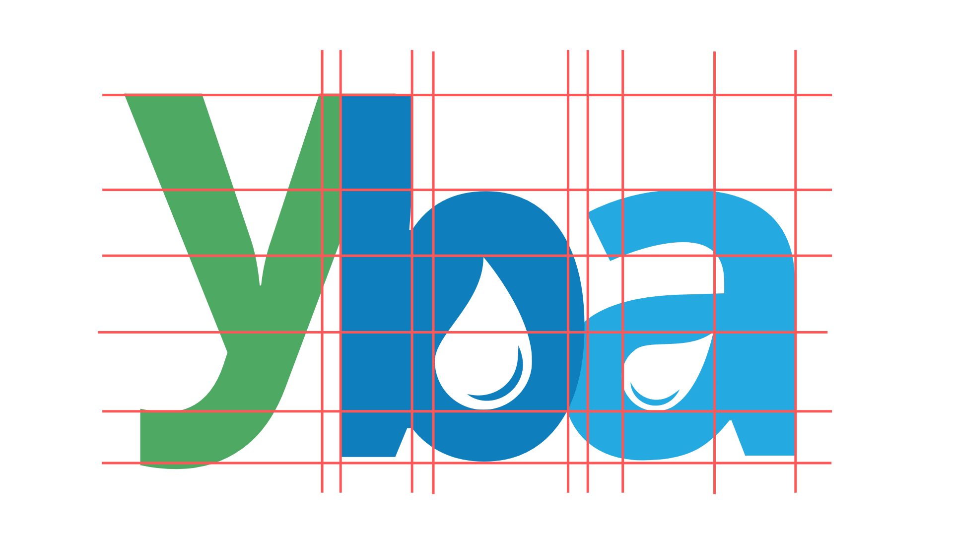
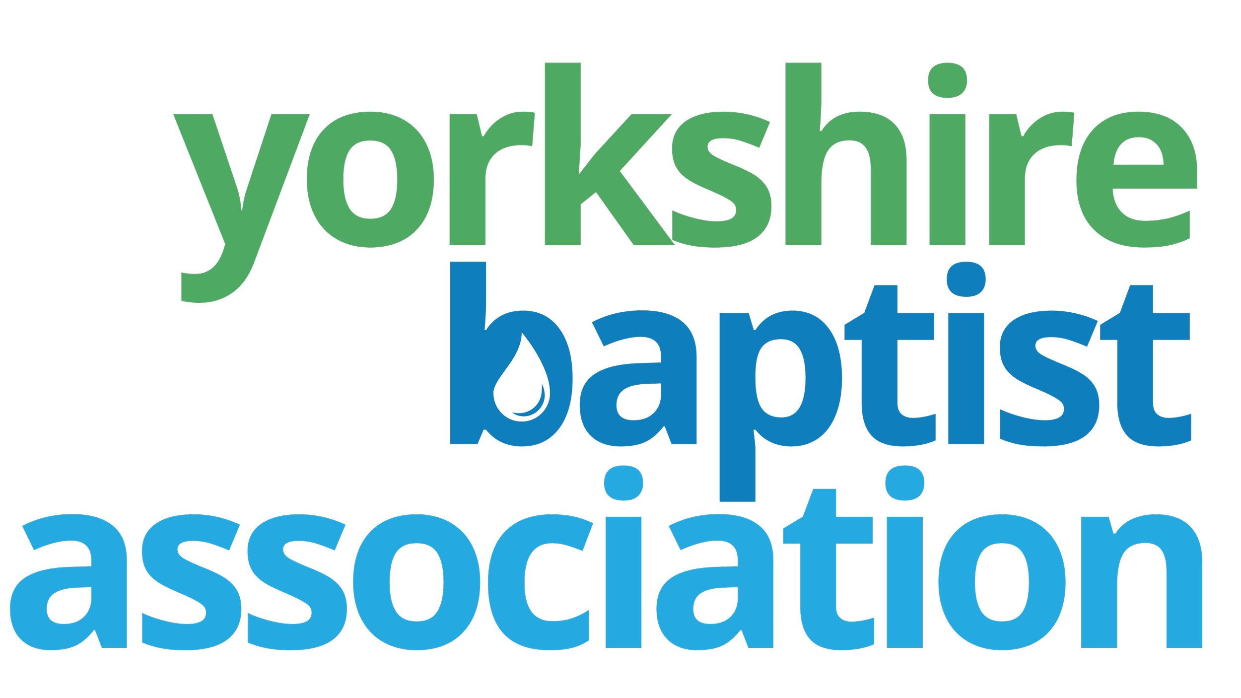

Our choice of colours:
Green: #4EA962
The Green represents Yorkshire, the wild and natural side of the county. It also carries over Green from the old logo and speaks of life and growth that is core to our vision.
Baptist Blue: #0E7EBD
The Baptist Blue is the same blue used by the Baptist Union of Great Britain. This aligns us as an Association which is part of that family.
Light Blue: #24AAE1
The Light Blue, for the Association section, keeps with the Baptist family feel and reminds us of the significance of baptism.
Fonts
We’ve chosen easy to read fonts that are clean and mature. This is a conscious decision.
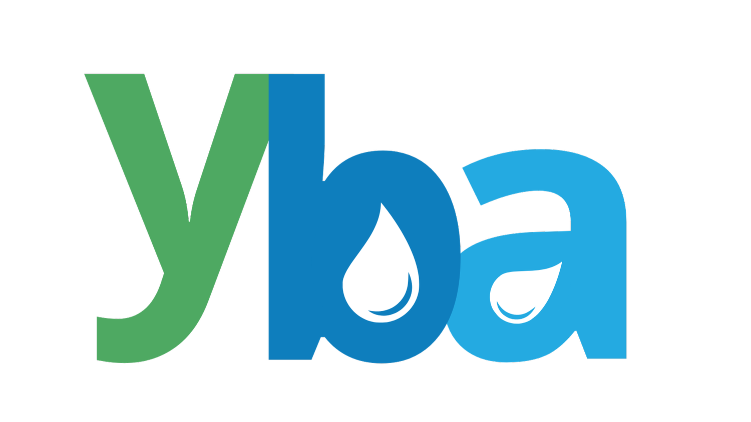
The full and condensed logo
We made a decision to not use uppercase which can sometimes make things formal or shouty. Instead we have lower case in use as we want to be a supportive and engaging Association, a partner and friend.
Often the Yorkshire Baptist Association is referred to as the ‘YBA’ and so a short version of the logo was also created. In both versions you’ll see an intentional water drop. This again draws on our connection as Baptists and the other aspects of water - reminding us of Jesus, the water of life, the refreshment that only Jesus brings and the desire to be in partnership with God’s will.
Brand guide
You can view our brand guide here: where we also unpack the language we use, the types of images and design approach.
We will be aiming to roll this brand out across our communications in the coming days and weeks.
A reminder again, if you need advice on how to communicate well at your church, please reach out using the contact form below.